Progressive Reduction
Taking the training wheels off for skilled users
When discussing Continuous Onboarding with UX and product people, they’ll often mention Progressive Disclosure. This is the practice of only revealing functionality and parts of a UI when required by the user's context, or when the user has shown the skill level to be ready for them.
While there is a lot of wisdom to this idea, I've noticed a counterintuitive trend in apps built for power usage. When the user starts out, they have a GUI (Graphical User Interface) that helps them learn how to do things. As user skill level increases over time, they can actually disable elements of the GUI, decreasing the clutter on the screen that they no longer need as a memory aid for how to do X or Y.
Take a look at how Figma shows you all of these buttons you can click that would modify your selection. This helps the new user discover what is possible!
Eventually, Figma users will learn keyboard shortcuts. At this point, they can press a shortcut (command+period on Mac) that will disable most of the UI. Now they are just interacting directly with Figma's infinite canvas data structure. Advanced users speed up and enter a flow state with total immersion. Manipulating a file feels as intuitive as reaching to grab something. It's just like movement.
I recently saw a post on LinkedIn where someone shared a five page PDF filled with keyboard shortcuts in Excel. Can you imagine how rewarding your mastery would feel if you learned all of them, and were able to interact with just a spreadsheet? No BS clogging your screen, just rows and columns? If you’re like Jason Chan and know how the data structure works and how to move... wouldn't the toolbar at the top feel like wasted screen space?
Luckily, you can hide it! Much better.
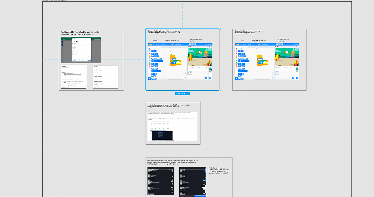
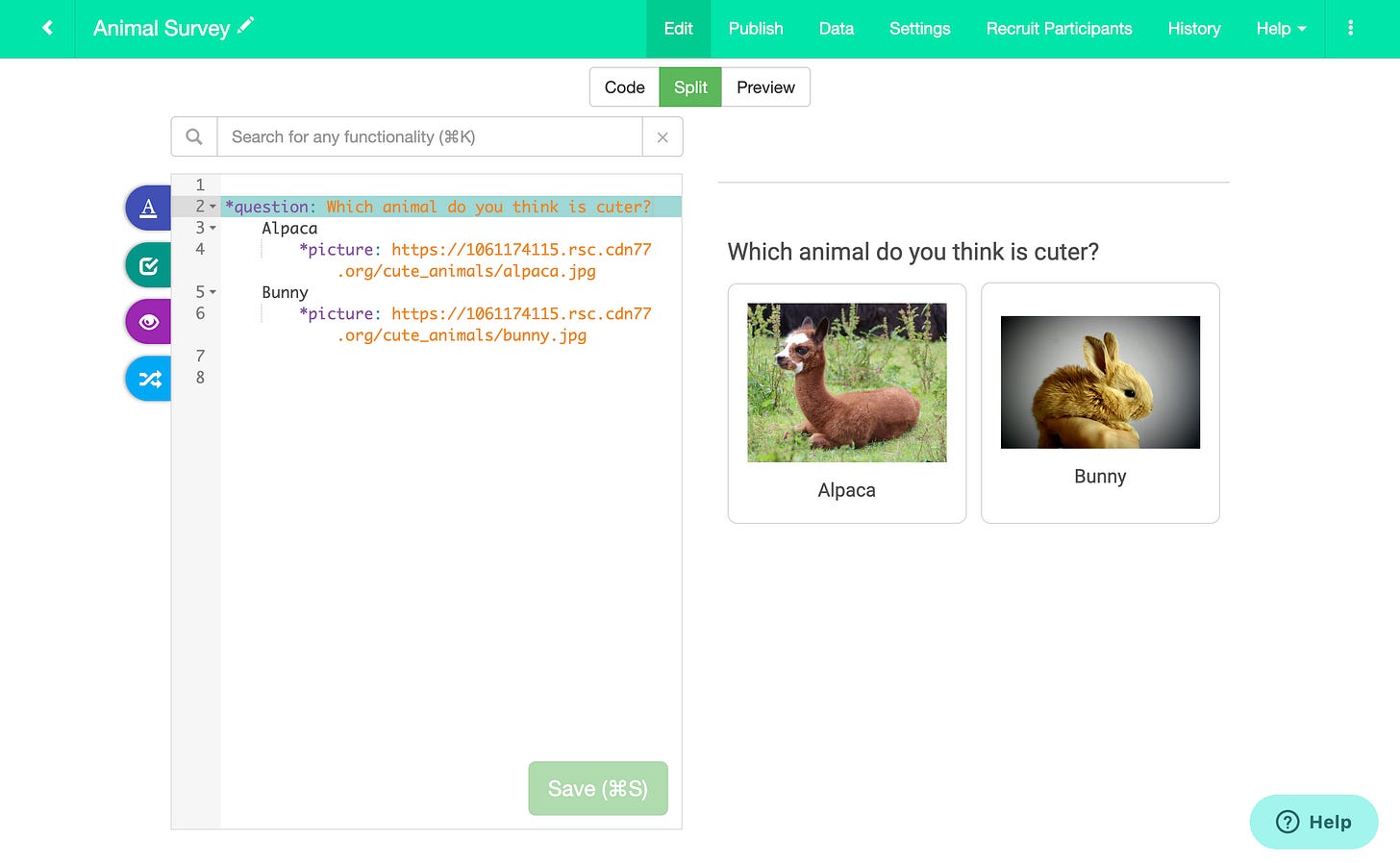
In GuidedTrack, a new user writing a survey would use the toolbar and fill out forms that generate code for them based on their inputs. Click insert and it places the code into your program.
Through repeated exposure, users begin to remember how to write the code on their own. At this point, they only look at the toolbar occasionally. They aren't slowed down by having to click through a bunch of different screens. The user actually gets faster, as they're able to produce code as quickly as they can type. Most apps only have a GUI, and therefore, creation will be just as slow every time.
The pattern for progressive reduction seems to be as follows: the GUI provides training wheels to understand the data structure of the application, and power users eventually want to interact with the application's data structure as directly as possible, with as much information density as possible. The next question becomes: How might we provide a smooth learning curve from new user to power user?


